
For developers of both internally-facing corporate applications and externally-facing web sites, a mobility strategy is no longer an option but a necessity. The reason is simple: mobile phones are where your audience is. Wherever you see people these days—waiting for a train, on line at the supermarket, working out at the gym—they are looking at their phones. Why wouldn’t you want to transform your marketing and communications so that you can reach and influence people via that phone in their hand?
Mobilizing Your Web Site
Web sites and apps should be seen as parts of an integrated approach to building and reinforcing connections with customers and prospects. Your web site is a platform to introduce your company and its value proposition. Once prospective customers and influencers have visited your site, getting them to download an app enables you to start to provide useful services and further engage with them. A mobile-friendly site and an app can work closely together: a click on a web site link can open a relevant page on a downloaded app.
A key first step is to make your web site mobile-friendly. This basically means designing or adapting the site to fit the limited screen real estate of a mobile phone. A website that can be called mobile responsive or mobile redirected is one that optimizes content and menus so that they fit into a small screen. Graphics are reworked and made smaller so that they download quickly enough to satisfy increasingly impatient mobile users. A mobile friendly site takes advantage of features like click to call and click to map, leveraging the GPS navigation that is built into phones.
The graphic below shows that last year there were more users of mobile devices than desktops. Forecasts indicate that the mobile device will continue to grow faster than desktop usage.

Also driving marketing efforts toward mobility: Google’s recent changes in how they index and prioritize mobile-based content. The term “Mobilegeddon” is currently being used by marketers to encourage the use of mobile friendly sites. Google recently announced that they intend to expand their use of mobile-friendliness as a criterion for search ranking. Another Google shift: inclusion of apps content as a basis for determining search results. Android smartphone users who have an app installed can open it directly from relevant mobile search results on Google.
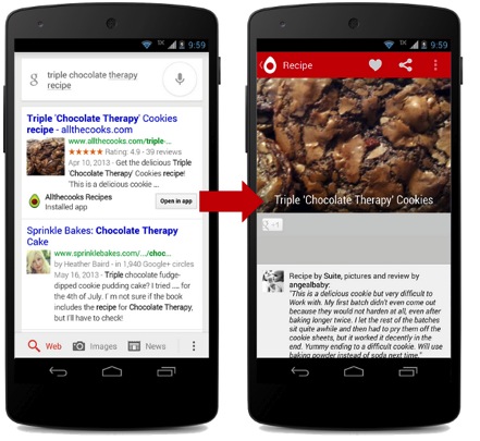
The below represents an example of how search results can lead a user directly to an app:
Mobile is on the rise and this has implications for everyone who communicates and markets. The fact that even now there are a lot of big and small companies that haven’t upgraded their sites to take advantage of the new realities of a mobile driven market means you can gain a significant advantage by optimizing your sites and apps for mobile.
The trend toward mobility shows no signs of abating. Common-sense business strategy calls for you to invest one way or another in mobile. Make your site mobile friendly and create an app that supports your marketing and promotion.
My advice to companies of all kinds and sizes: go mobile NOW.
About the Author
Guy Kennett is Managing Director of Newport Board Group’s practice in South Florida. He has extensive experience developing mobility strategies and mobile apps. To discuss how your company’s marketing program can harness the power of mobility, contact or learn more about Guy here.

